Going against the norm of healthcare websites
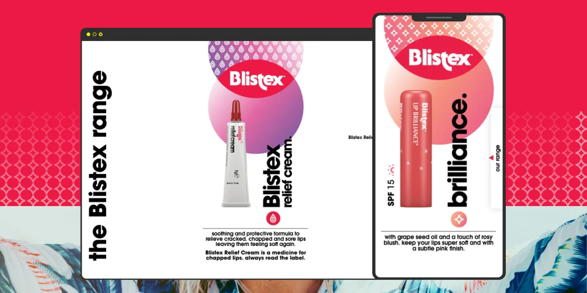
- BrandBlistex
- Timeframe3 months
- Our RoleUser Experience Design Wireframing Design Systems Website Development UI Design
It’s widely accepted in the healthcare sector that product distributors have a website to represent their brand, as a presence as well as a way to direct people to stockists. These websites are quite standard and often fairly quickly put together. At Insites that’s not exactly how we do things…
We wanted to showcase the Blistex rebrand, prove that these sites can still be achieved using the latest technology and give customers an all round better experience when interacting with brands. With their reputation as a leading innovator in lip care it only felt right to ensure the design and technology strategy were in keeping.
1 The Client
The Blistex brand has been a global leader in lip care and lip health for over 70 years. Their products are sold in over 80 countries worldwide and the Blistex tradition is still carried on by the third generation of the founding family.
2 The Brand
We wanted to showcase the Blistex rebrand, prove that these sites can still be achieved using the latest technology and give customers an all round better experience when interacting with brands. With their reputation as a leading innovator in lip care it only felt right to ensure the design and technology strategy were in keeping.


3 Unique Problems
Blistex has a very loyal customer base and as with any rebrand maintaining that trust is key. At the same time taking more market share meant being bold and a change in creative direction. People still needed to recognise the products in the new packaging. How could we link the online and offline world to help aid the sales of Blistex instore?


4 The Strategy
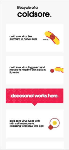
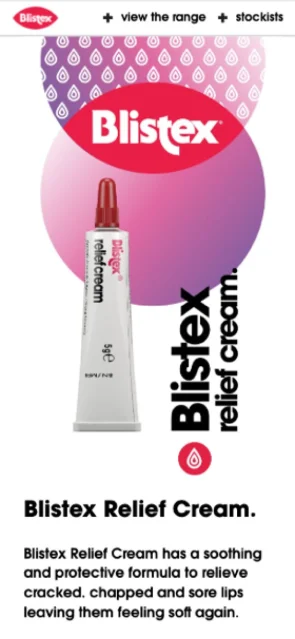
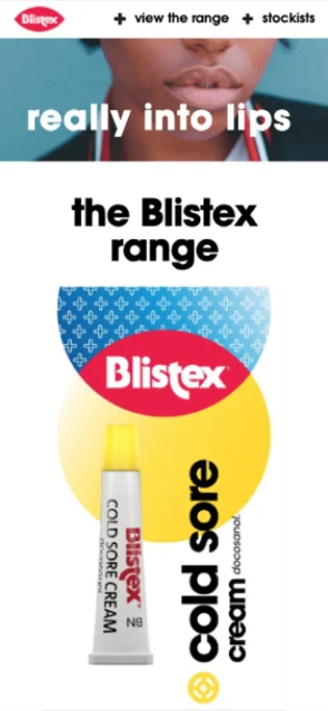
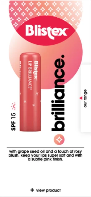
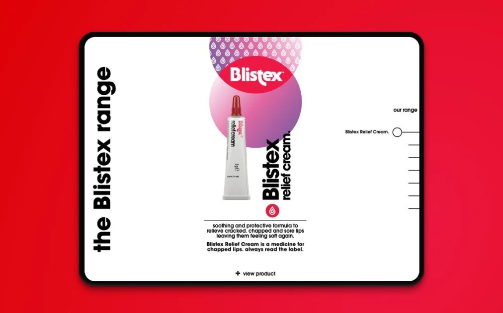
With new creative and branding we wanted to ease the existing audience into it. To do that we felt that having the products out of their packaging people are more likely to recognise the cream they love and use on regular basis. From there we wanted to introduce the new branding, one product at a time, in a rich immersive experience. High resolution and allowing users to go at their own pace whilst being visual enough to keep all audiences entertained. The studio got to work in creating SVGs (vector) packaging of each product allowing the site to be viewed at any size without any pixelation whatsoever. Keeping the product out of pack and separating it out we could animate each product and introduce it one by one on screen. What you see on screen is the very same packaging you would see in store.
5 The Tech
A modern brand required a modern solution. Our approach was develop Blistex.co.uk in Gatsby supported by a headless CMS in Strapi. Build it fast, secure, and scalable with performance, SEO and security
- Gatsby
- Strapi
- Docker
- Mailchimp


